Перейти к основному содержанию Перейти к нижнему колонтитулу
Misaligned CMF Design(fridge color trends) directly correlates with increased warranty claims when a portable refrigerator’s housing scratches, fades, or fails to meet user expectations in the field. Choosing a color or texture based on outdated consumer preferences is a direct path to bloated inventory and negative product reviews that damage brand credibility. For outdoor equipment manufacturers, the wrong finish isn’t just an aesthetic mistake; it’s a functional failure that signals poor engineering and impacts sales velocity against competitors who understand the target environment.
This brief provides a technical standard operating procedure for your 2026 product development cycle. We will analyze the data behind the dominant “Overland” color palette to determine which shades align with market demand. We will also examine the material science behind specific textures like “litchi grain” for superior scratch resistance and explain why high-gloss coatings consistently underperform in outdoor settings. Finally, we’ll outline a strategy for using limited edition colors to drive seasonal sales without disrupting core production lines.
The “Overland” Palette: Is Sand or Olive Drab Trending?
For 2026, sand and olive drab are functional base colors, not trend-drivers; the market is shifting towards pairing warm neutrals with vibrant jewel tones like teal and burgundy.
2026 Focus: Earth-Inspired Neutrals
The color direction for 2026 is moving decisively toward comprehensive, earth-inspired palettes. Industry analysis shows a focus on warm earth tones, deep greens, and burnt umber as foundational colors for new product lines. This isn’t about a single trending color like “sand,” but about creating a sense of connection to nature through softer, muted palettes. Pantone’s choice of Cloud Dancer, a creamy off-white, confirms this shift toward sophisticated, warm neutrals.
The Role of Sand and Olive: Supporting, Not Leading
In this new landscape, sand and olive drab function as essential grounding elements rather than primary, trend-setting colors. Their value is in their versatility as a neutral foundation, allowing them to balance more vibrant accent colors within an earthy palette. While contextually relevant, they are not the focal point for 2026 product designs. Think of them as the reliable backdrop, not the main event.
| Color Strategy Element | Traditional Approach (Sand/Olive Focus) | 2026 CMF Trend (Neutral + Jewel Tone) |
|---|---|---|
| Role of Earth Tones | Primary / Focal Color | Base / Grounding Color |
| Market Perception | Classic, safe, expected | Modern, sophisticated, forward-looking |
| Application Example | Used as a standalone color for the entire product housing | Used as a neutral foundation paired with vibrant jewel tones like teal or burgundy |
The Emerging Dominance of Jewel Tones
The more dominant and forward-looking narrative for 2026 involves pairing those soft neutrals with rich jewel tones. Colors like deep teal and burgundy are taking center stage, using shades like sand or olive as a calculated backdrop to create contrast and visual depth. This combination results in a more sophisticated and premium aesthetic. For product developers, this means that while sand and olive remain safe choices, relying on them as the primary color risks appearing dated.
Texture Tech: Why Does “Litchi Grain” Hide Scratches?
The pebbled, three-dimensional topography of litchi grain conceals wear by disrupting light reflection, causing minor scratches to become optically lost within the pattern’s shadows and highlights.
Light Disruption and Visual Masking
The primary reason litchi grain texture works so well is its three-dimensional, pebbled surface. This uneven topography prevents light from reflecting in a continuous, straight line, which is what makes a scratch on a smooth surface so obvious. Instead, the non-uniform grain scatters light in countless directions. Any minor abrasions or scuffs get visually absorbed into the texture’s existing shadows and highlights, making the surface appear consistent long after it leaves the factory.
| Finish Type | Scratch Concealment Mechanism | Лучший пример использования |
|---|---|---|
| Litchi Grain | Light Scattering & Pattern Masking | High-traffic surfaces requiring aesthetic longevity (e.g., cooler exteriors, automotive interiors). |
| Matte Finish | Diffused Reflection | Outdoor equipment exposed to frequent handling and potential scuffs. |
| High-Gloss Finish | Specular Reflection (Poor Concealment) | Decorative applications with low physical contact; not ideal for rugged outdoor gear. |
Synergy with Scratch-Resistant Materials
Litchi grain is most effective when embossed onto already durable materials, like the PVC or PU artificial leathers we use for our cooler housings. These synthetic compounds are engineered for high wear resistance from the start. The texture adds a powerful visual defense layer on top of a physically tough material. This combination creates a dual-protection system that significantly enhances product longevity in demanding outdoor environments.
Functional Durability in High-Wear Applications
We specify litchi grain for high-contact products for a clear reason: it maintains its aesthetic appeal over time. This finish is a core part of a CMF (Color, Material, Finish) strategy focused on real-world durability. It provides the premium look of leather but with superior practical resilience against daily use. For products like portable fridges that are constantly being loaded, bumped, and slid around, this texture reduces the appearance of wear and reinforces the product’s value as a low-maintenance, long-lasting investment.
Expand Your Brand with Custom Car Coolers.

Matte vs. Gloss: Why Does High-Gloss Fail Outdoors?
For durable outdoor equipment, a matte finish is the superior choice; its light-scattering properties conceal daily wear and tear, while high-gloss surfaces amplify every scratch and scuff.
Reflective Surfaces Amplify Scratches and Wear
High-gloss finishes fail in rugged environments because their smooth, reflective nature makes imperfections glaringly obvious. When light hits a glossy surface, it bounces off uniformly, creating a mirror-like sheen. Any disruption to that surface—a scratch, a scuff, or even a fingerprint—changes the angle of reflection and immediately draws the eye. On a portable fridge used for camping or off-roading, this means every minor incident leaves a visible mark, causing the unit to look old and worn out long before its time.
| Performance Attribute | Matte Finish | High-Gloss Finish |
|---|---|---|
| Scratch Visibility | Low (Surface scatters light, hiding minor marks) | High (Reflective surface amplifies imperfections) |
| UV Degradation | Less noticeable (Gradual fading is masked) | More noticeable (Uniform color makes fading obvious) |
| Техническое обслуживание | Low (Hides dust, fingerprints, and smudges well) | High (Requires frequent cleaning to maintain appearance) |
| Slip Resistance | Superior (Micro-texture provides better grip) | Poor (Smooth surface can be hazardous when wet) |
Impact of UV Exposure and Fading
Long-term sun exposure is another area where gloss finishes underperform. While a high-quality gloss coating might include UV inhibitors, any breakdown or fading becomes immediately visible. The uniform color makes any patchiness or discoloration stand out. A matte finish, on the other hand, is inherently better at hiding these gradual changes. Its surface already scatters light, which helps to conceal the subtle shifts in color intensity caused by UV degradation, preserving a more consistent appearance over the product’s lifespan.
The Practical Advantages of Matte Finishes
Matte finishes are purpose-built for high-contact, functional products. Their ability to conceal dust, smudges, and minor scratches means less maintenance and a better look during everyday use. For a portable fridge that’s constantly being moved and handled, a matte surface provides superior slip resistance, making it safer to carry, especially in damp conditions. The focus shifts from preserving a fragile, perfect sheen to delivering a robust, reliable surface that maintains its integrity through frequent use and exposure to the elements.
Limited Editions: Can Color Drive Seasonal Sales?
Seasonal color releases are a proven retail strategy, tapping into scarcity to accelerate purchase decisions and generate significant social media buzz for brands.
Introducing limited-edition colors is a direct and effective way to move inventory. The right colorway, released at the right time, can create a sales event out of a standard product line. It’s a tactic used successfully across industries to drive urgency, reinforce brand innovation, and capture seasonal consumer spending.
The Scarcity Effect: Driving Urgency with Exclusive Colors
Limited-edition color schemes create a sense of urgency by leveraging a consumer’s fear of missing out (FOMO). This psychological trigger encourages immediate purchase decisions, bypassing longer consideration cycles. The appeal is based on owning something unique and time-sensitive, which elevates the product’s perceived value.
- Data shows that 62% of consumers prefer limited-edition offerings over standard products.
- Seasonal colors frame a product as a collectible, converting passive interest into faster sales.
Boosting Brand Recall and Social Media Buzz
A unique seasonal color makes a product more memorable and, more importantly, shareable online. A striking colorway stands out on social media feeds, encouraging user-generated content that acts as free marketing. Strategic color-enhanced packaging can increase brand recall by as much as 33%, making the product instantly recognizable both online and in-store. Limited releases signal that the brand is current and innovative.
In-Store Execution: Translating Color into Impulse Buys
At the point of sale, seasonal colors in packaging and retail displays directly influence purchasing behavior. Thematic visuals create an emotional connection that helps convert casual browsers into buyers. This is especially potent during holiday seasons, when shoppers are already primed for special offerings.
- About 40% of consumers make unplanned purchases during holiday promotions influenced by visual appeal.
- Sectors like beauty and beverage have seen sales boosts of 45% and 20% respectively from well-executed seasonal releases.
Заключение
Choosing the right color, material, and finish is a strategic decision that goes beyond simple aesthetics. A well-selected palette connects your product to current market trends, while functional textures and durable finishes improve product longevity and user satisfaction. These CMF choices are essential for building a competitive and resilient portable fridge lineup.
To see how these CMF strategies can align with your brand, contact our team to discuss custom OEM solutions for your next production run. We can provide our complete catalog of material samples and color options to help you get started.
Часто задаваемые вопросы
What are the trending colors for camping gear in 2026?
The primary trend for 2026 is nature-inspired palettes featuring sophisticated deep greens, warm earth tones like burnt umber, and creamy neutrals such as Pantone’s Cloud Dancer. The dominant theme pairs these soft neutrals with richer jewel tones like teals and burgundies. While classic colors like sand and olive drab remain relevant, they are now used more as grounding base colors or accents rather than the main focal point.
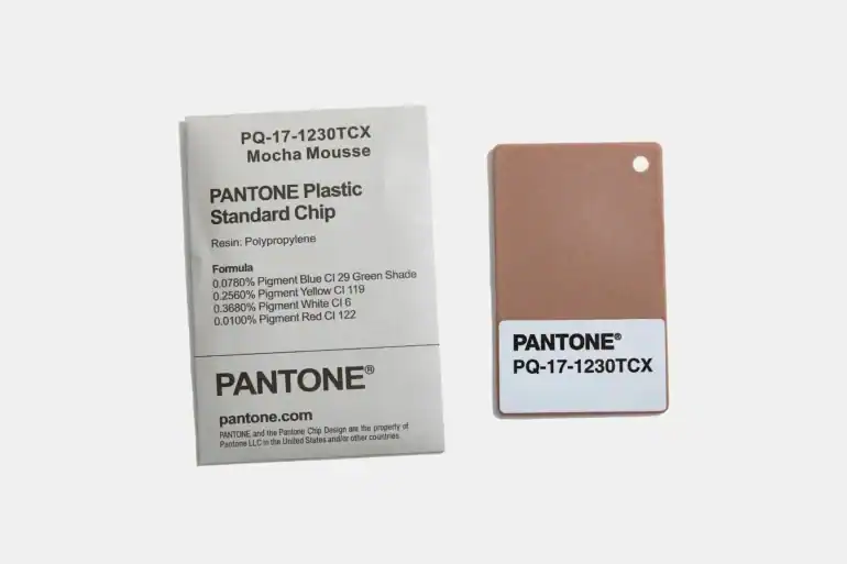
Can I order a custom Pantone color for the housing?
Yes, custom Pantone (PMS) color matching for product housing is a standard service we offer for volume orders. This process requires a minimum order quantity (MOQ) to cover the cost of custom material compounding. Simply provide the specific Pantone code, and we will produce a physical color chip for your final approval before beginning the full production run.
Which plastic texture is most scratch-resistant?
For maximum scratch resistance, a heavily textured matte finish is the industry-standard recommendation. Textures like a bead-blast or stipple (e.g., an MT-11020 standard) are highly effective at hiding minor scuffs and abrasions. The uneven surface diffuses light, making scratches significantly less visible compared to a smooth or high-gloss finish, which highlights every imperfection.
Do you offer camo pattern dipping?
Yes, we provide camouflage and other complex patterns through a process called hydrographic printing, also known as water transfer printing or dipping. We offer a wide selection of standard camo patterns and can also work with custom-supplied designs for large-volume projects. This application results in a durable, seamless finish that conforms perfectly to the product’s geometry.